Terracotta and Sage Green Living Room: Warm & Earthy Decor Ideas
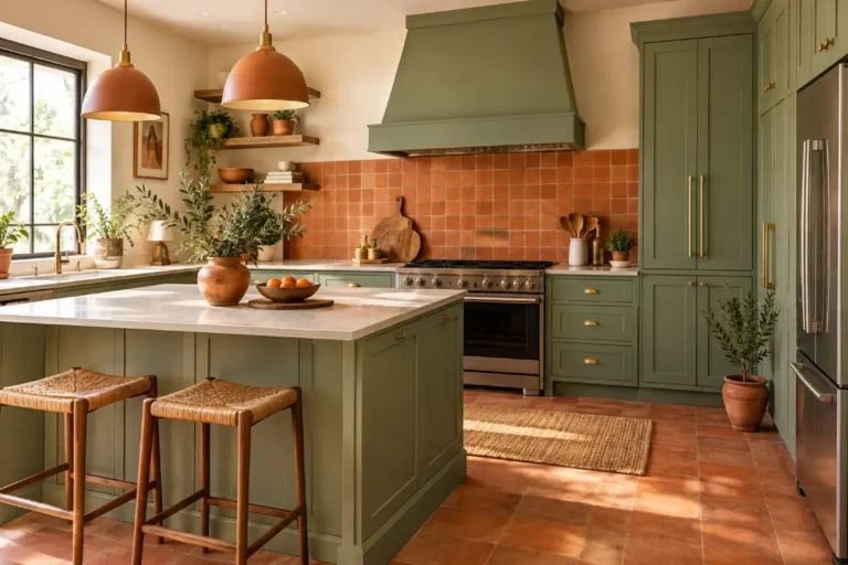
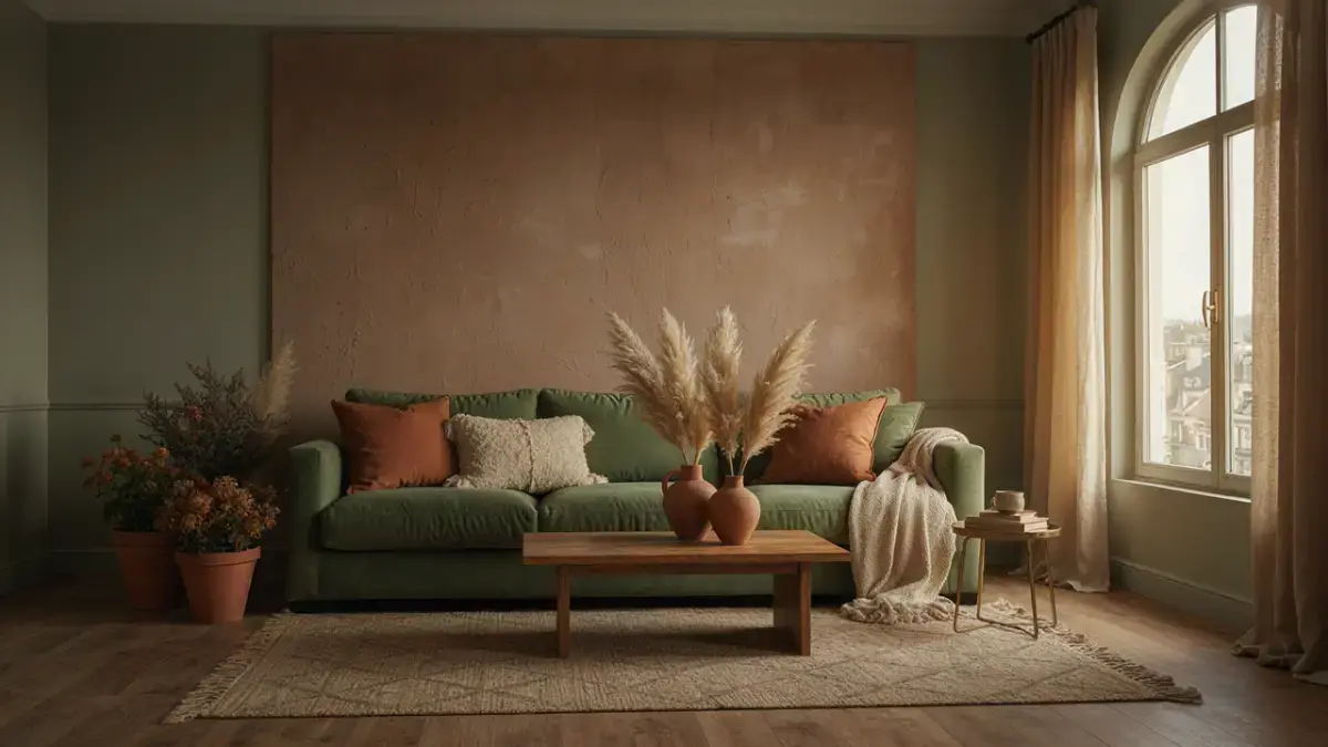
A terracotta and sage green living room has a special kind of warmth. Terracotta brings the sunbaked character of clay, while sage green adds a quiet botanical quality that keeps the space feeling fresh. Together, these colors create an earthy interior that feels relaxed, collected, and welcoming rather than overly styled.
This combination works particularly well for homeowners and renters who want more personality without committing to a dramatic color scheme. It can be introduced through paint, furniture, rugs, curtains, artwork, cushions, or even a few carefully chosen accessories. That flexibility makes an Earthy Living Room Palette: Terracotta & Sage Green suitable for everything from a compact apartment to a large open-plan family room.
The key is balance. Terracotta is naturally warm and visually energetic, while sage is softer and more subdued. Neither color needs to dominate. In fact, the most sophisticated rooms often allow one shade to establish the mood while the other appears in smaller, repeated accents.
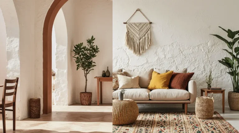
Your existing finishes also matter. Light wood, creamy walls, woven materials, aged brass, natural stone, and warm neutral upholstery all complement this color pairing beautifully. If your room already has cool gray furniture or stark white walls, the palette can also help introduce warmth without requiring a complete redesign.
An experienced designer would not start by buying accessories. The better approach is to study the room first. Notice the amount of natural light, the size of the space, the undertones of the flooring, and the furniture you already own. These details determine how strong or subtle your terracotta and sage combination should be.
This guide shows you how to create a balanced palette, choose furniture and textures, shop with intention, and avoid common mistakes. The goal is not simply to make the room look earthy. It is to make it feel comfortable, cohesive, and genuinely livable.
Table of Contents
1- Earthy Living Room Palette: Terracotta & Sage Green for a Warm, Balanced Space
The first step in creating an Earthy Living Room Palette: Terracotta & Sage Green is deciding which color should play the larger role. This choice changes the entire personality of the room.
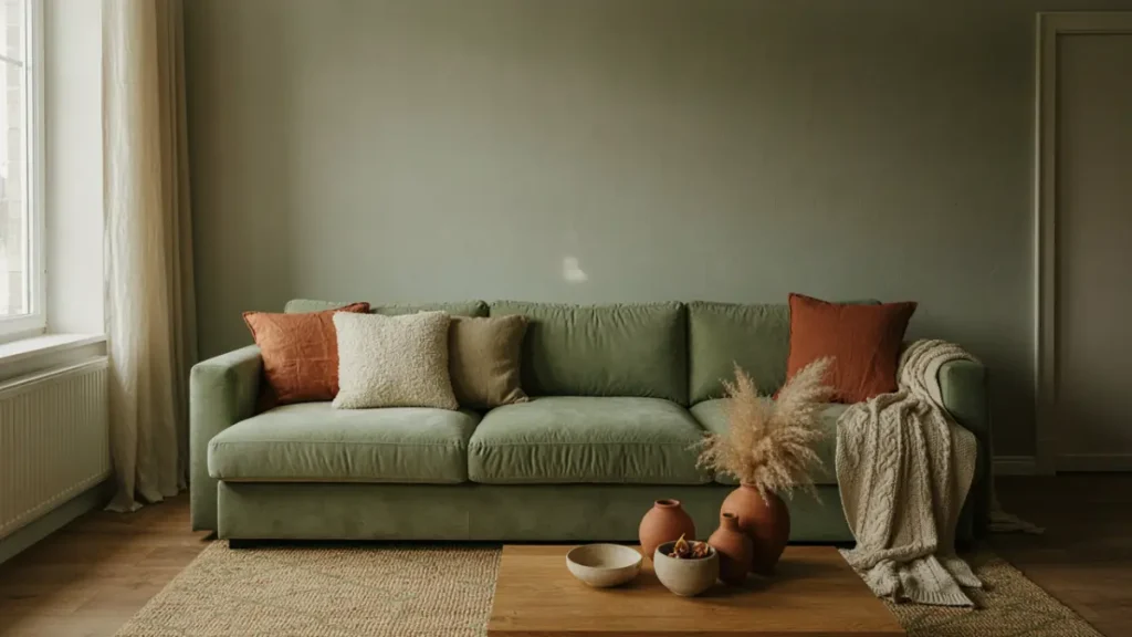
Sage green works beautifully as a primary color when you want the room to feel calm and naturally inspired. A sage-painted wall, large rug, or substantial sofa can establish a soft backdrop. Terracotta can then appear through cushions, pottery, artwork, and smaller upholstered pieces.
This approach is especially useful in bright living rooms with generous windows. Natural daylight brings out the botanical quality of sage, while terracotta accents prevent the room from feeling too cool or visually flat.
Terracotta can also take the lead. A terracotta accent wall, statement chair, or substantial rug creates a richer and more dramatic atmosphere. Sage then acts as a balancing color, softening the intensity and introducing visual calm.
Use this direction when the room receives less natural light or when you want a more intimate, grounded feeling. Deep terracotta can make a large room feel more enveloping without relying on heavy dark colors.
If neither color feels right as the dominant shade, build the room around warm neutrals instead. Cream, oatmeal, warm beige, and soft mushroom can become the main foundation, while terracotta and sage provide the personality.
This is one of the easiest approaches for renters because it avoids permanent changes. Neutral walls and furniture can stay in place while color enters through textiles and accessories.
The proportions also matter. A useful designer strategy is to let one color appear in several areas rather than placing all of it in one corner. For example, if terracotta appears in a rug, echo it in a cushion and a ceramic vase. If sage is used on a chair, repeat it in artwork or drapery.
The repetition creates continuity. Your eye moves around the room naturally because the colors feel connected rather than isolated.
Natural wood is one of the best supporting elements for this palette. Oak, walnut, ash, and medium-toned woods all work well, although the exact choice should depend on the undertones already present in the space.
Light oak creates a breezier, more contemporary look. Walnut adds richness and works particularly well when terracotta is used generously. Choose wood based on the atmosphere you want rather than matching every piece exactly.
When the room contains multiple wood tones, do not try to eliminate every variation. A collected interior often looks better when the materials share a similar warmth while remaining slightly different.
Creamy whites are also important. They provide visual breathing room between the earthy colors. Without enough neutral space, terracotta and sage can begin to compete.
A designer tip is to pay attention to the ceiling and trim. If your walls are warm, a bright blue-white trim can create an unexpected contrast. A softer warm white usually produces a more seamless transition.
Lighting changes the appearance of both colors as well. Terracotta can become richer in warm evening light, while sage may appear more muted. This is why paint samples should always be tested at different times of day before committing to a large surface.
Another important consideration is room size. In a smaller living room, use the palette in controlled doses. A light neutral background with small terracotta and sage accents can create personality without visually shrinking the space.
Large rooms can handle stronger blocks of color. A large sage sofa or terracotta rug can help anchor an open area that might otherwise feel disconnected.
The beauty of this palette is that it is adaptable. You can make it modern with clean furniture and restrained accessories, rustic with raw wood and woven textures, traditional with classic upholstery and aged metals, or organic with linen, pottery, and plenty of natural greenery.
The colors do not determine the style on their own. The surrounding materials, shapes, and finishes do.
2- Cozy fall spa bathroom decor : Colors, Textures & Furniture
Once the overall palette is established, the next challenge is selecting colors, textures, and furniture that make the room feel layered rather than flat.
Start with the undertones. Not every sage green is the same, and not every terracotta has the same warmth. Some sage shades lean gray, some lean yellow, and others have a more olive character. Terracotta can range from dusty clay to rich red-orange.
Pairing shades with similar intensity usually produces a more polished result. A muted sage works beautifully with a softened terracotta rather than a highly saturated orange.
This is especially important when working with existing furniture. If your sofa is a pale warm beige, a dusty terracotta pillow may look more cohesive than a vivid rust accent.
Textures are what turn a color scheme into a comfortable living room.
Linen is an excellent choice when you want an airy, relaxed feeling. It softens the visual impact of stronger colors and works especially well with sage green.
Velvet creates a richer atmosphere. A terracotta velvet chair or cushion can add depth to a room with simple furniture. Use it when you want a more dramatic focal point rather than a casual look.
Wool is useful for rugs and throws because it adds visual weight and warmth. A wool rug in a muted pattern can connect the furniture arrangement while making the room feel more grounded.
Bouclé can work in a modern living room, particularly in cream or soft beige. Because it already has a strong texture, it is better used selectively alongside smoother terracotta and sage fabrics.
Woven materials such as rattan, cane, jute, and seagrass reinforce the earthy character of the palette. They are especially effective when the room needs more natural texture but already has plenty of color.
Furniture shapes matter just as much as upholstery.
Rounded sofas and curved chairs can make the earthy palette feel soft and organic. Straight-lined furniture creates a cleaner, more contemporary impression.
If your room is already visually busy, choose simpler silhouettes. If the architecture and furniture are minimal, a sculptural chair or interesting coffee table can add personality.
A sage green sofa is a strong investment piece because the color is relatively easy to live with year-round. You can change the supporting colors as seasons change without replacing the main furniture.
Terracotta is often easier to introduce through smaller pieces. An accent chair, ottoman, bench, or upholstered dining-style chair can create a focal point without dominating the room.
If you are shopping for a sofa, prioritize comfort and proportion first. Color should come second. A beautiful terracotta sofa that is too large for the room will create more problems than it solves.
Measure doorways, wall lengths, walking paths, and the space between furniture pieces before ordering. This is particularly important for apartment living.
The coffee table should also relate to the scale of the seating. A large sectional usually needs a larger table, while a compact sofa arrangement benefits from something lighter.
For rugs, choose a size that visually connects the seating rather than leaving the furniture floating around the edges. Ideally, at least the front legs of major seating pieces should sit on the rug in many standard arrangements.
Pattern can be used, but it should support the palette rather than introduce another competing theme. A rug with subtle terracotta and sage details can unify the room beautifully.
Artwork provides another opportunity to bring in the colors without making them feel repetitive. Landscapes, abstract works, botanical prints, and clay-inspired compositions can all reinforce the earthy direction.
A designer tip: do not match every accessory to the exact same shade. Slight variation creates depth. One sage item may be softer or more olive than another, while terracotta accents can range from clay to muted rust.
That variation makes the room feel collected over time instead of purchased as a matching set.
3- Earthy Living Room Palette: Terracotta & Sage Green Styling & Buying Guide
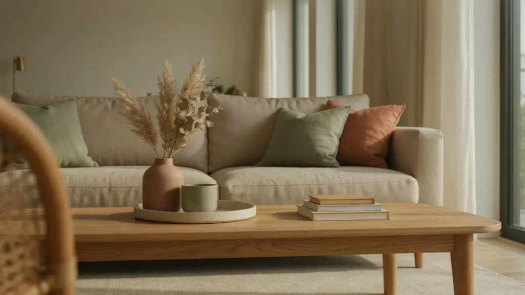
Styling this palette successfully is less about buying more and more about buying strategically.
Begin with the largest pieces already in the room. If your sofa, flooring, and curtains are staying, let them determine how much new color is necessary.
For a neutral sofa, start with two or three cushions in terracotta and sage. Add a throw in a related neutral and finish with a textured rug. This small group can create a noticeable transformation without requiring a complete room makeover.
If the room already has a colorful sofa, choose the second color more carefully. For example, a terracotta sofa may need only restrained sage accents and warm neutrals to look finished.
When shopping, look for materials that add something beyond color. A plain sage cushion and a textured sage cushion are not visually interchangeable. The second option contributes dimension.
The same principle applies to decorative objects. Handmade-looking pottery, carved wood, woven baskets, stone accessories, and aged metal finishes all strengthen the earthy quality of the design.
Do not buy seasonal decor simply because it matches the colors. The strongest purchases can remain useful throughout the year.
A terracotta ceramic vase can work in autumn, spring, and summer. A sage cushion can remain on the sofa regardless of season. This creates better value and a more timeless room.
A simple buying hierarchy can help keep the process focused:
| Priority | What to Buy | Why It Matters |
|---|---|---|
| High | Rug, seating textiles, curtains | Establishes the main visual palette |
| Medium | Cushions, throws, accent furniture | Adds layering and personality |
| Low | Small accessories | Finishes the room without defining it |
For a modest refresh, focus on textiles and one or two natural accessories. This is often enough to shift the atmosphere.
For a larger redesign, consider one substantial furniture piece in either terracotta or sage, then build around it.
The most important shopping rule is to avoid buying everything from the same collection. Coordinated products can look convenient, but a room tends to feel more authentic when pieces have subtle differences in texture, finish, and form.
When choosing curtains, consider how much light you want to preserve. Soft linen or linen-look panels can filter natural light while keeping the room relaxed.
Choose deeper, heavier treatments when you need more privacy or insulation. Terracotta curtains can make a room feel dramatically warmer, while neutral curtains keep the palette quieter.
For accent lighting, warm bulbs complement this palette especially well. A ceramic table lamp in an earthy finish can reinforce the color story while creating softer evening light.
Plants are another smart addition. Their natural greens can bridge the sage tone with the room’s other earthy materials. Choose plants based on the available light rather than simply selecting them for appearance.
A large leafy plant works well beside a sectional or empty corner, while smaller plants are useful on shelves and side tables.
When arranging accessories, vary height and shape. A low stack of books, a medium vase, and a taller branch arrangement can create a balanced display.
Avoid lining objects across a shelf at exactly the same height. Variation creates a more relaxed rhythm.
One of the most effective styling techniques is grouping items in odd numbers. A small cluster of three objects can feel more natural than a pair of identical decorative pieces, especially when the materials vary.
Do not forget negative space. Every surface does not need to be filled.
A clean coffee table with one tray and a few intentional objects can look more sophisticated than a crowded table covered in accessories.
For renters, removable solutions are ideal. Textiles, artwork, lamps, rugs, and freestanding storage can completely change the look of a room without permanent alterations.
For homeowners, paint can offer a larger transformation. A sage wall can provide a calm backdrop, while a terracotta-painted niche or accent wall can create a more dramatic focal point.
Always test paint samples in several lighting conditions. Earthy colors can shift significantly from morning to evening.
4- Terracotta and Sage Green Living Room: Expert Tips & Mistakes to Avoid
The biggest mistake with this palette is assuming that every earthy color automatically belongs together. A room can become muddy when too many warm browns, oranges, greens, and beiges are combined without a clear hierarchy.
Decide on your main color, supporting color, and neutral foundation first. This simple structure keeps the room organized.
Another common mistake is using terracotta only in one isolated corner. If a large terracotta chair sits alone without repetition elsewhere, it can feel disconnected.
Repeat the color subtly through artwork, a cushion, a ceramic piece, or part of the rug. The repetition does not need to be exact.
The same rule applies to sage.
A sage sofa looks more integrated when another element carries a related green tone. This can be a plant, throw, artwork, or even a small accent object.
Scale is another area where decorating mistakes frequently happen. Oversized accessories can overwhelm a small room, while tiny objects disappear in a large space.
Choose accessories according to the furniture and architecture around them. A large console can support a substantial lamp and artwork. A narrow shelf may need just a few smaller objects.
Avoid placing too many matching items together. A complete set of terracotta pottery, sage cushions, green curtains, and coordinated artwork may sound cohesive, but it can make the space feel staged.
Instead, mix finishes.
Pair matte pottery with woven textiles. Combine natural wood with metal. Add smooth ceramic next to rougher stone or jute.
Contrast keeps the room visually interesting.
A second major mistake is ignoring the existing flooring. Cool gray flooring can make warm terracotta feel stronger, while honey-toned wood can amplify its warmth.
This does not mean you need to replace the floor. Simply adjust the intensity of the palette around it.
Lighting can also undermine an otherwise successful design. A beautiful sage wall may appear dull under harsh cool lighting.
Use layered lighting wherever possible. Combine ambient, task, and accent lighting to make the room feel more flexible.
A designer tip I frequently use is to assess the room from the entrance. The first view should immediately communicate the mood you want.
If the first thing you see is a pile of decorative items, rethink the arrangement. If you see a balanced combination of texture, color, and natural materials, the room will feel more intentional.
Another useful technique is to remove accessories rather than adding them. Once everything is in place, take away one or two objects that do not contribute to the overall composition.
Editing is often what separates a decorated room from a professionally styled room.
Be careful with trend-heavy accessories, too. If an object is fashionable but does not suit your architecture or lifestyle, it is unlikely to age well.
Instead, invest in furniture and materials that you genuinely enjoy and use accessories to update the look.
For households with children or pets, choose durable textiles and secure heavier objects. A beautiful room still needs to function for real life.
If you entertain frequently, keep pathways clear and choose a coffee table with enough practical space. Decorative styling should never interfere with conversation or movement.
Architectural features should also remain visible. If your living room has built-in shelving, exposed beams, a fireplace, or beautiful windows, use the color palette to emphasize those features rather than compete with them.
One of my favorite ways to make a terracotta and sage green living room feel sophisticated is to introduce an unexpected dark accent. A little charcoal, deep brown, or aged bronze can give the palette structure.
Use this in small amounts, such as a lamp base, picture frame, side table, or hardware.
Finally, remember that an earthy room should feel connected to nature, not themed around nature. Natural materials, organic shapes, imperfect ceramics, and muted colors create that feeling more effectively than excessive botanical prints or rustic accessories.
When the balance is right, terracotta provides warmth, sage provides calm, and the supporting neutrals give both colors room to breathe.
Conclusion
A terracotta and sage green living room can feel warm, modern, relaxed, and timeless when the colors are handled with intention. The secret is not choosing more earthy elements. It is choosing the right elements and giving each one a clear role.
An Earthy Living Room Palette: Terracotta & Sage Green works because the colors naturally balance one another. Terracotta adds warmth and energy, while sage green introduces softness and a connection to the natural world.
Start with your existing furniture and finishes, then decide which color should lead. Build the foundation with warm neutrals, introduce texture through rugs and textiles, and repeat your chosen colors throughout the room in subtle ways.
Most importantly, design for your actual lifestyle. Choose furniture that fits the space, materials that can handle everyday use, and decorative pieces that you will continue to enjoy long after the initial makeover.
The result should not simply photograph beautifully. It should feel good when you sit down, host friends, read a book, or spend a quiet evening at home.
That is what makes a terracotta and sage green living room successful: the palette creates the atmosphere, but thoughtful design makes the room truly livable.
FAQs about Terracotta and Sage Green Living Room: Warm & Earthy Decor Ideas
Q1: Does fall bathroom accessories go well with sage green in a living room?
A: Yes, terracotta and sage green are complementary earthy tones. The warm, grounding red-orange of terracotta perfectly balances the cool, calming undertones of sage green to create an inviting interior.
Q2: How do I style a terracotta and sage green living room without overwhelming the space?
A: Choose one color as the dominant backdrop like sage green walls and introduce terracotta through accent pieces such as throw pillows, rugs, ceramic vases, and leather seating.
Q3: What neutral colors complement a terracotta and sage green palette?
A: Warm neutrals like cream, beige, natural oak wood tones, off-white, and warm brass hardware blend seamlessly with this color combination.